


CSS 3 provides linear-gradient() function. That creates an image using options supplied into that function(). So, we can use this image as background image of any HTML element. Moreover, they are faster than gradient image created by image editor. In this tutorial, I’ll show how to make beautiful form fields using CSS 3 gradients.
Styling text field using CSS gradient
Let’s take simple form field
<div class="field">
<input type="text" placeholder="Name" class="gredient_input" />
</div>
<div class="field">
<input type="text" placeholder="Name" class="gredient_input" />
</div>
<div class="field"> <input type="text" placeholder="Name" class="gredient_input" /> </div>
Let’s make inner gradient using CSS. here we’ll style class=”gredient_input”
.gredient_input {
/* styling background using linear gradient */
background-image: linear-gradient(top, rgba(0, 0, 0, 0.02) 0%, rgba(255, 255, 255, 0.02) 50%);
border: 1px solid rgba(0, 0, 0, 0.16);
height: 25px;
padding: 5px 10px 5px 5px;
font-size: 15px; width: 200px;
border-radius: 3px;
}
.gredient_input {
/* styling background using linear gradient */
background-image: linear-gradient(top, rgba(0, 0, 0, 0.02) 0%, rgba(255, 255, 255, 0.02) 50%);
border: 1px solid rgba(0, 0, 0, 0.16);
height: 25px;
padding: 5px 10px 5px 5px;
font-size: 15px; width: 200px;
border-radius: 3px;
}
.gredient_input {
/* styling background using linear gradient */
background-image: linear-gradient(top, rgba(0, 0, 0, 0.02) 0%, rgba(255, 255, 255, 0.02) 50%);
border: 1px solid rgba(0, 0, 0, 0.16);
height: 25px;
padding: 5px 10px 5px 5px;
font-size: 15px; width: 200px;
border-radius: 3px;
}
Output
linear-gradient() function
- The above function takes several arguments. First argument of this function is side and value could be top, left, to top, to bottom, degree etc
- Let’s start with a simple example.
background-image: linear-gradient(top, #EEEEEE, #DDDDDD);background-image: linear-gradient(top, #EEEEEE, #DDDDDD);
background-image: linear-gradient(top, #EEEEEE, #DDDDDD);
Output:-

- You could supply color with opacity options also.
background-image: linear-gradient(top, rgba(255,255,255,0.1), rgba(255,255,255,0.2));background-image: linear-gradient(top, rgba(255,255,255,0.1), rgba(255,255,255,0.2));
background-image: linear-gradient(top, rgba(255,255,255,0.1), rgba(255,255,255,0.2));
- You could supply gradient start colors by percentage after color arguments
background-image: linear-gradient(top, rgba(255,255,255,0.1), rgba(255,255,255,0.2));background-image: linear-gradient(top, rgba(255,255,255,0.1), rgba(255,255,255,0.2));
background-image: linear-gradient(top, rgba(255,255,255,0.1), rgba(255,255,255,0.2));
In above example gradient end is given at 50% so gradient effect will stop at 50%.
See Result
- Cross browser implementation
background-image: -moz-linear-gradient(top, #EEE, #DDD);background-image: -o-linear-gradient(top, #EEE, #DDD);background-image: -webkit-linear-gradient(top, #EEE, #DDD);background-image: -webkit-gradient(linear, left top, left bottom, color-stop(0, #EEE), color-stop(1, #DDD)); filter: "progid:DXImageTransform.Microsoft.gradient(startColorStr=#EEE, EndColorStr=#DDD)";background-image: linear-gradient(top, #EEE, #DDD)background-image: -moz-linear-gradient(top, #EEE, #DDD); background-image: -o-linear-gradient(top, #EEE, #DDD); background-image: -webkit-linear-gradient(top, #EEE, #DDD); background-image: -webkit-gradient(linear, left top, left bottom, color-stop(0, #EEE), color-stop(1, #DDD)); filter: "progid:DXImageTransform.Microsoft.gradient(startColorStr=#EEE, EndColorStr=#DDD)"; background-image: linear-gradient(top, #EEE, #DDD)
background-image: -moz-linear-gradient(top, #EEE, #DDD);
background-image: -o-linear-gradient(top, #EEE, #DDD);
background-image: -webkit-linear-gradient(top, #EEE, #DDD);
background-image: -webkit-gradient(linear, left top, left bottom, color-stop(0, #EEE), color-stop(1, #DDD)); filter: "progid:DXImageTransform.Microsoft.gradient(startColorStr=#EEE, EndColorStr=#DDD)";
background-image: linear-gradient(top, #EEE, #DDD)


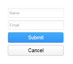
Styling HTML form input text box using CSS3 gradient
<div class="field">
    <input type="text" placeholder="Email" class="inset_input" />
</div>
.inset_input {
    border: 1px solid rgba(0, 0, 0, 0.16);
    height: 25px;
    padding: 5px 10px 5px 5px;
    font-size: 15px;
    /*border-radius*/
    -moz-border-radius: 3px;
    -webkit-border-radius: 3px;
    border-radius: 3px1;
    background-image: -webkit-linear-gradient(top, rgba(0, 0, 0, 0.02) 0%, rgba(255, 255, 255, 0.02) 50%);
    background-image: -moz-linear-gradient(top, rgba(0, 0, 0, 0.02) 0%, rgba(255, 255, 255, 0.02) 50%);
    background-image: linear-gradient(top, rgba(0, 0, 0, 0.02) 0%, rgba(255, 255, 255, 0.02) 50%);
    width: 200px;
    /*box-shadow*/
    -moz-box-shadow: inset 0 1px 2px rgba(0, 0, 0, 0.1);
    -webkit-box-shadow: inset 0 1px 2px rgba(0, 0, 0, 0.1);
    box-shadow: inset 0 1px 2px rgba(0, 0, 0, 0.1)
}
.inset_input:focus {
    border: 1px solid #999 !important;
    /*box-shadow*/
    -moz-box-shadow: 0 1px 2px rgba(0, 0, 0, 0.1) !important;
    -webkit-box-shadow: 0 1px 2px rgba(0, 0, 0, 0.1) !important;
    box-shadow: 0 1px 2px rgba(0, 0, 0, 0.1) !important
}
<div class="field">
<input type="text" placeholder="Email" class="inset_input" />
</div>
.inset_input {
border: 1px solid rgba(0, 0, 0, 0.16);
height: 25px;
padding: 5px 10px 5px 5px;
font-size: 15px;
/*border-radius*/
-moz-border-radius: 3px;
-webkit-border-radius: 3px;
border-radius: 3px1;
background-image: -webkit-linear-gradient(top, rgba(0, 0, 0, 0.02) 0%, rgba(255, 255, 255, 0.02) 50%);
background-image: -moz-linear-gradient(top, rgba(0, 0, 0, 0.02) 0%, rgba(255, 255, 255, 0.02) 50%);
background-image: linear-gradient(top, rgba(0, 0, 0, 0.02) 0%, rgba(255, 255, 255, 0.02) 50%);
width: 200px;
/*box-shadow*/
-moz-box-shadow: inset 0 1px 2px rgba(0, 0, 0, 0.1);
-webkit-box-shadow: inset 0 1px 2px rgba(0, 0, 0, 0.1);
box-shadow: inset 0 1px 2px rgba(0, 0, 0, 0.1)
}
.inset_input:focus {
border: 1px solid #999 !important;
/*box-shadow*/
-moz-box-shadow: 0 1px 2px rgba(0, 0, 0, 0.1) !important;
-webkit-box-shadow: 0 1px 2px rgba(0, 0, 0, 0.1) !important;
box-shadow: 0 1px 2px rgba(0, 0, 0, 0.1) !important
}
Styling form buttons using CSS3 gradient
Blue gradient button
.blue_button {
    border: solid 1px #328cca;
    height: 40px;
    font-size: 20px;
    /*border-radius*/
    -moz-border-radius: 5px;
    -webkit-border-radius: 5px;
    border-radius: 5px;
    color: #fff;
    background-image: -moz-linear-gradient(top, #3798db, #2c7cd2);
    background-image: -o-linear-gradient(top, #3798db, #2c7cd2);
    background-image: -ms-linear-gradient(top, #3798db, #2c7cd2);
    background-image: -webkit-linear-gradient(top, #3798db, #2c7cd2);
    background-image: -webkit-gradient(linear, left top, left bottom, color-stop(0, #3798db), color-stop(1, #2c7cd2));
    filter:"progid:DXImageTransform.Microsoft.gradient(startColorStr=#3798db, EndColorStr=#2c7cd2)";
    background-image: linear-gradient(top, #3798db, #2c7cd2);
    width: 215px;
    background-color: #2b96f1;
    /*box-shadow*/
    -moz-box-shadow: 0 0 5px rgba(0, 0, 0, 0.2);
    -webkit-box-shadow: 0 0 5px rgba(0, 0, 0, 0.2);
    box-shadow: 0 0 5px rgba(0, 0, 0, 0.2);
    cursor: pointer
}
.blue_button:hover {
    background-image: -moz-linear-gradient(top, #3fadf9, #3493f9);
    background-image: -o-linear-gradient(top, #3fadf9, #3493f9);
    background-image: -webkit-linear-gradient(top, #3fadf9, #3493f9);
    background-image: -webkit-gradient(linear, left top, left bottom, color-stop(0, #3fadf9), color-stop(1, #3493f9));
    filter:"progid:DXImageTransform.Microsoft.gradient(startColorStr=#3fadf9, EndColorStr=#3493f9)";
    background-image: linear-gradient(top, #3fadf9, #3493f9)
}
.blue_button {
border: solid 1px #328cca;
height: 40px;
font-size: 20px;
/*border-radius*/
-moz-border-radius: 5px;
-webkit-border-radius: 5px;
border-radius: 5px;
color: #fff;
background-image: -moz-linear-gradient(top, #3798db, #2c7cd2);
background-image: -o-linear-gradient(top, #3798db, #2c7cd2);
background-image: -ms-linear-gradient(top, #3798db, #2c7cd2);
background-image: -webkit-linear-gradient(top, #3798db, #2c7cd2);
background-image: -webkit-gradient(linear, left top, left bottom, color-stop(0, #3798db), color-stop(1, #2c7cd2));
filter:"progid:DXImageTransform.Microsoft.gradient(startColorStr=#3798db, EndColorStr=#2c7cd2)";
background-image: linear-gradient(top, #3798db, #2c7cd2);
width: 215px;
background-color: #2b96f1;
/*box-shadow*/
-moz-box-shadow: 0 0 5px rgba(0, 0, 0, 0.2);
-webkit-box-shadow: 0 0 5px rgba(0, 0, 0, 0.2);
box-shadow: 0 0 5px rgba(0, 0, 0, 0.2);
cursor: pointer
}
.blue_button:hover {
background-image: -moz-linear-gradient(top, #3fadf9, #3493f9);
background-image: -o-linear-gradient(top, #3fadf9, #3493f9);
background-image: -webkit-linear-gradient(top, #3fadf9, #3493f9);
background-image: -webkit-gradient(linear, left top, left bottom, color-stop(0, #3fadf9), color-stop(1, #3493f9));
filter:"progid:DXImageTransform.Microsoft.gradient(startColorStr=#3fadf9, EndColorStr=#3493f9)";
background-image: linear-gradient(top, #3fadf9, #3493f9)
}
Gray Gradient Button
.white_button {
    border: 1px solid #bbb;
    height: 40px;
    font-size: 20px;
    /*border-radius*/
    -moz-border-radius: 5px;
    -webkit-border-radius: 5px;
    border-radius: 5px;
    color: #000;
    background-image: -moz-linear-gradient(top, #fff, #f1f1f1);
    background-image: -o-linear-gradient(top, #fff, #f1f1f1);
    background-image: -webkit-linear-gradient(top, #fff, #f1f1f1);
    background-image: -webkit-gradient(linear, left top, left bottom, color-stop(0, #fff), color-stop(1, #f1f1f1));
    filter:"progid:DXImageTransform.Microsoft.gradient(startColorStr=#fff, EndColorStr=#f1f1f1)";
    background-image: linear-gradient(top, #fff, #f1f1f1);
    width: 215px;
    /*box-shadow*/
    -moz-box-shadow: 0 0 5px rgba(0, 0, 0, 0.2);
    -webkit-box-shadow: 0 0 5px rgba(0, 0, 0, 0.2);
    box-shadow: 0 0 5px rgba(0, 0, 0, 0.2);
    cursor: pointer
}
.white_button {
border: 1px solid #bbb;
height: 40px;
font-size: 20px;
/*border-radius*/
-moz-border-radius: 5px;
-webkit-border-radius: 5px;
border-radius: 5px;
color: #000;
background-image: -moz-linear-gradient(top, #fff, #f1f1f1);
background-image: -o-linear-gradient(top, #fff, #f1f1f1);
background-image: -webkit-linear-gradient(top, #fff, #f1f1f1);
background-image: -webkit-gradient(linear, left top, left bottom, color-stop(0, #fff), color-stop(1, #f1f1f1));
filter:"progid:DXImageTransform.Microsoft.gradient(startColorStr=#fff, EndColorStr=#f1f1f1)";
background-image: linear-gradient(top, #fff, #f1f1f1);
width: 215px;
/*box-shadow*/
-moz-box-shadow: 0 0 5px rgba(0, 0, 0, 0.2);
-webkit-box-shadow: 0 0 5px rgba(0, 0, 0, 0.2);
box-shadow: 0 0 5px rgba(0, 0, 0, 0.2);
cursor: pointer
}